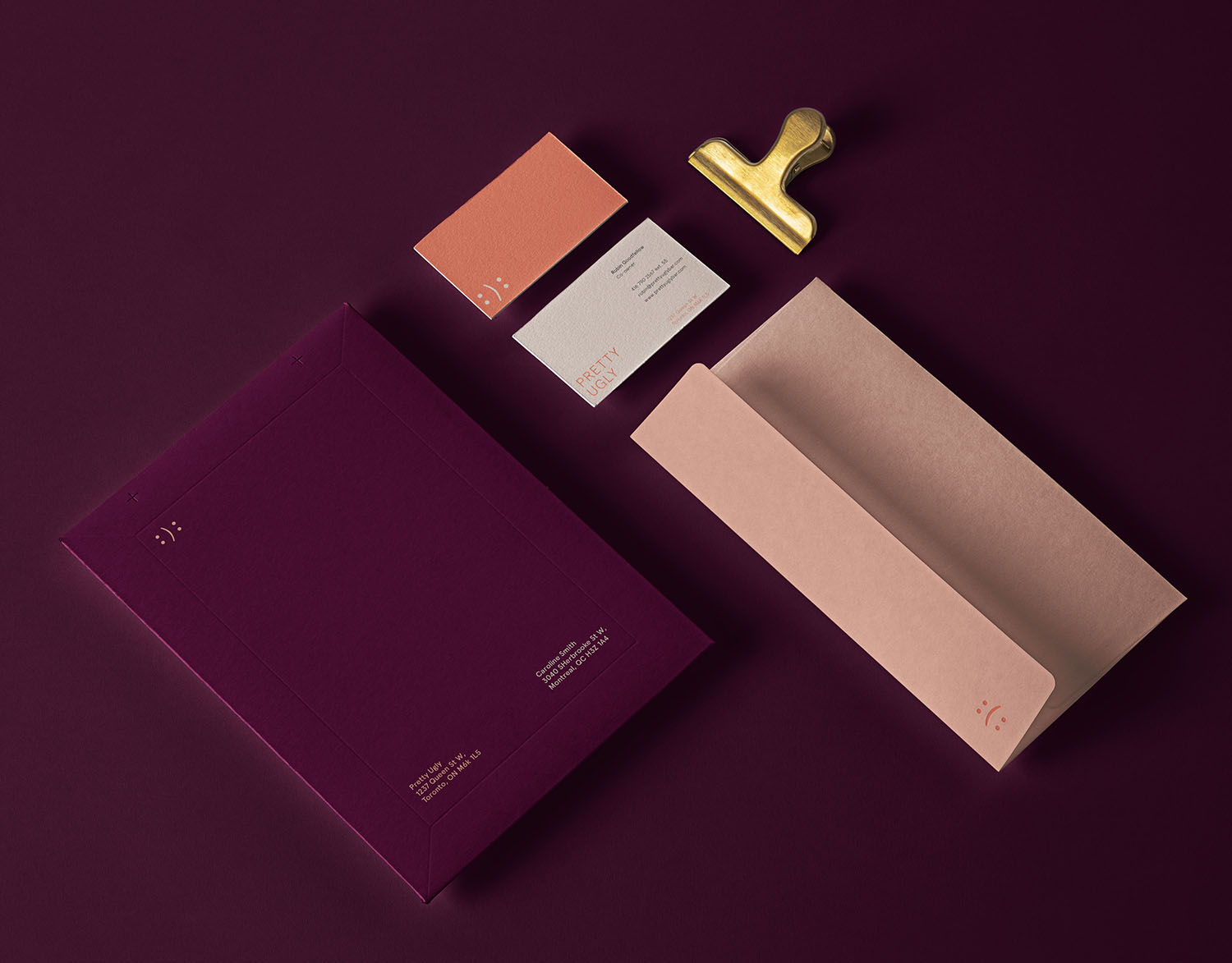
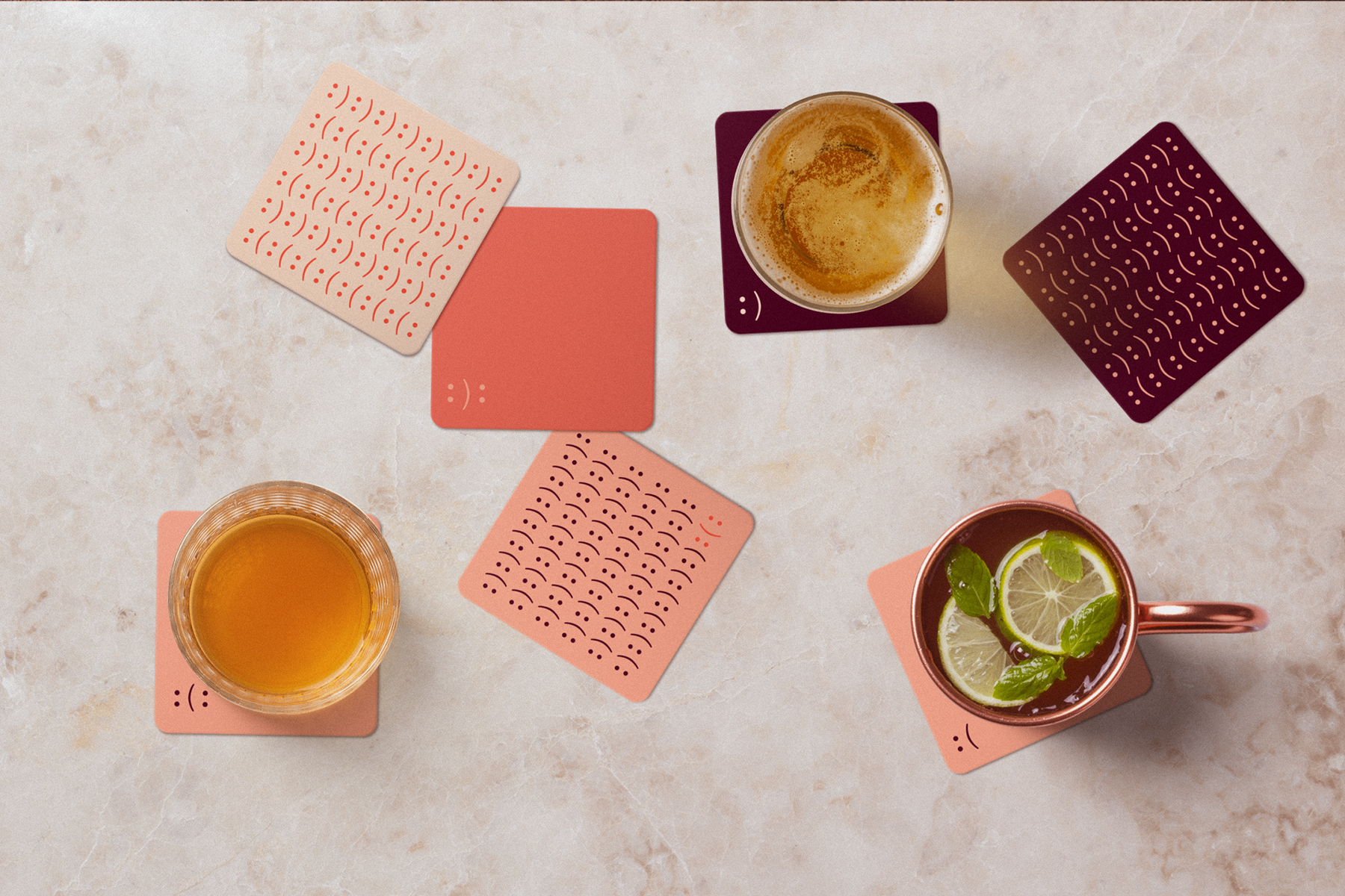
Turn device to view site

Contact

About

BD logo
The Brief
Create a logo and new identity system for Pretty Ugly, which is cocktail bar in Toronto, along with various relevant promotional items for the brand.
Roles:  Ideation & Design
Year:  2021
business cards for Pretty Ugly bar

Pretty Ugly Bar

Branding
Typography and colors used in branding for Pretty Ugly Bar
The Ideation
Pretty Ugly is a bar that is distinctive through its approach to making quality cocktails with all sorts of ingredients that may seem strange at first, until you try it. A bar with a name like “Pretty Ugly” definitely has a unique personality. I thought about the oxymoron in their name and the duality that it represents. I felt drawn to their playful spirit but wanted to maintain a touch of elegance for their thoughtfully crafted cocktails. I set out to symbolize this dichotomy in the brand to show the pretty and the ugly.
stationery design for Pretty Ugly Bar
Coaster design for Pretty Ugly bar BrandingMatch Design for Pretty Ugly Bar BrandingMenu design and napkin application for Pretty Ugly Bar Branding
The Solution
The design approach of the brand is done in an elegant attitude, but keeps the playful essence of the bar in its humor and creativity with the symbol. The mark that accompanies the name of the bar represents the duality of the bar’s identity and the tasteful union of unlikely ingredients. This mark is made of two colons and a parenthesis to create an emoticon in its most basic form of characters. When it comes to color, the symbol can come alive in hues inspired by the bar's cocktails.

Other projects